
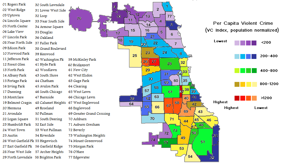
I think the added level of complication is worth it. There are the shades of purple on the north, which should come as no surprise. The blues on the northwest and southwest sides almost form a ring around the West Side red zone in Garfield Park. The greens interestingly seem to signal transitionary areas. That is, they are bordered on either side by decent and decidedly dangerous areas. A significant question is whether the crime rate varies uniformly over these areas or changes rapidly somewhere in the middle, with the side bordering on safe areas being itself also safe and the area bordering on the dangerous areas also itself being dangerous. I suspect it is, more often than not, the latter, judging by my various ill-advised bike rides throughout this fair city.
After more than a year and a half of radio silence, the Chicago Crime Blog (not to be confused with the great old mashup site ChicagoCrime.org, a precursor of sorts to EveryBlock) is back with new visual representations of the city’s crime stats. The map above breaks down violent crimes per capita in all 77 community areas.
Here’s hoping CCB gives us an update on one of its more…enlightening…features: the “Best Place” map.
Thanks to Uptown Update for the link.