
You would have to be blind or unconscious not to notice the infestation of red brick behemoths wherever gentrification has steamrolled in. Let’s just agree at the outset to their general loathsomeness.
Glad we could settle that. Now, because at YoChicago we are all about compassion and understanding, let’s try at least to comprehend why they have propagated so relentlessly: they are a reflection of a notion (sadly misguided) of creating “context,” of blending in (or “blanding in,” as our fearless leader has suggested) to the existing urban fabric.
What, precisely, is the problem with a building that doesn’t blend / bland in? Good design doesn’t have to draw attention to itself, but it certainly doesn’t have to look like everything around it (or a bad imitation of everything around it).
We need to acknowledge when people are bold enough to do something different, even if they don’t get the whole thing exactly right. Which is the case with this recent condo / retail project on Southport.
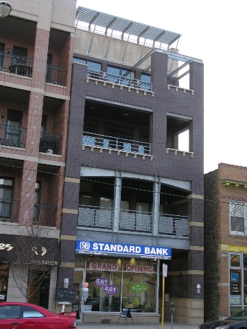
The building earns props for interesting materials. There are some very nice colorations in the “gray” bricks, which in sunlight actually have all kinds of blue and purple values, crisply complemented by the metal railings and exposed structural elements. The sunscreen up top is also snazzy. But the Georgian-esque dentils as a decorative string course are really a little idiotic. And couldn’t someone have convinced the groundfloor tenant to do something about that atrocious sign? Didn’t we just cover this?
You could make pretty much the same argument about the mixed-use building at the corner of Cornelia and Ashland
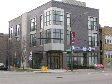
which, possessed of a nice clean design free of architectural faux pas, is nevertheless afflicted with similarly thoughtless signage.